
Sketchy Stuff from January 2023
Wow. We’re almost to the end of February and I haven’t uploaded my sketch stuff from January yet. Way to […]
Wow. We’re almost to the end of February and I haven’t uploaded my sketch stuff from January yet. Way to […]

It’s been far too long since I’ve had some dragon themed artwork here on… you know… dragonbones.net! I’m still working […]

I was thinking it might be a fun thing to post all the sketches here that I did for various […]

I have some news regarding my Patreon Page that I think may make some of you very happy.
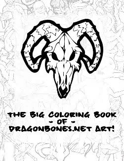
The Dragonbones.Net Coloring Book – Pay What You Want! It’s long overdue, but I finally hit publish on the updated […]
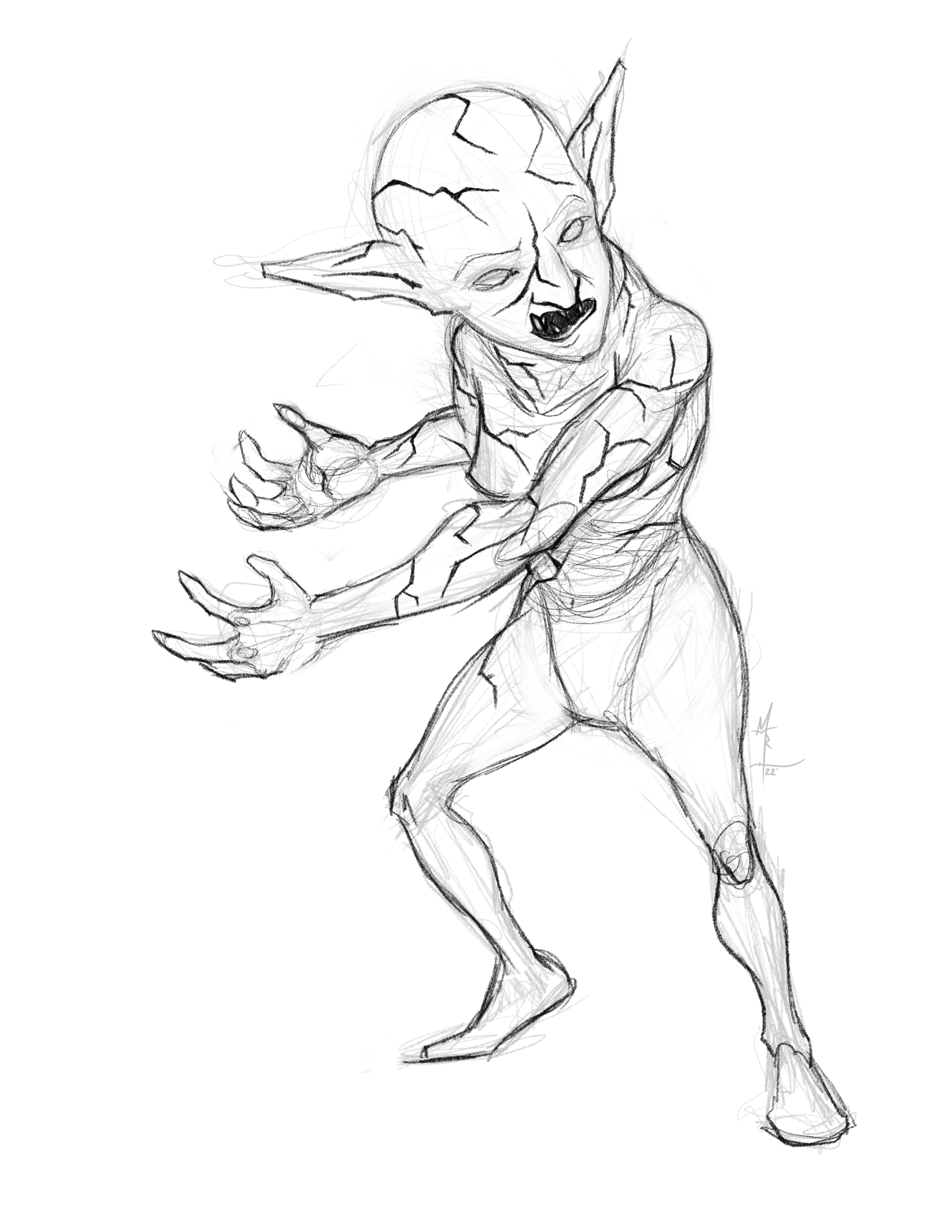
This is the rough sketch / concept for something that’s been knocking around in my brain meats – the Magma […]