The Quick & Dirty RPG Design in Google Docs – a guide to get you into doing layout work in Google Docs – fast, fun, and free.
Even this ‘quick and dirty’ version of the layout process takes a little bit to get through, so I’m adding a short Table of Contents here in the event you’re looking for something specific.
Credit Where Due
Before I start into all of this, I wanted to thank the user /u/YaAlex on reddit. They’ve created a number of Docs templates that you can copy then edit to fit your content any way you would like. It was looking at those templates and figuring out what was involved that lead me down a long and winding road that lead me here.
So if you want the real quick and dirty version – go check out their stuff, copy them, and edit them to your heart’s content!
Still here? Awesome. Read on, my friend.
First Things First: The Content
It may seem kind of obvious, but I would feel remiss if I didn’t point out that you have to start with quality content.
If you’ve started your process here, instead of writing up some really great ideas for your ttrpg, I would suggest that you stop now and go do that. Making things look pretty will only get you so far, while quality content could be scribbled on the back of a napkin and people will still care.
Write up your idea anywhere. Longhand in a notebook, in your phone’s note app of choice (Google Keep will even copy your Keep Note into a Google Doc when you’re ready) or yes, even in Google Docs. It doesn’t matter.
What matters is writing the idea down. Then reviewing it and editing it. Get it right and then move it into a layout document. Not before.
In addition to causing you to focus on the wrong thing, it will also cause you to do double work for layout. Usually more than once. And that, my friend, is just annoying.
Formatting
Formatting your document in a way that looks and feels like the classic ttrpg books is why your here in the first place, so let’s get to it!
Headers – They Do So Much
It amazes me how many folks still don’t realize this yet, but headers do a lot of work in most modern software packages.
What’s more, they’re a super easy way to keep things organized in your own head.
Use the headers in your Google Doc like the levels of an Outline. H1 is the first level, H2 is when you’ve moved in one tab, H3 is another tab in, etc. Use a header for each section you’re working on and then copy (or write if you ignored my very first suggestion in this post) and then move on to the next element.
Move In / Use a Higher Number Header for Subsections
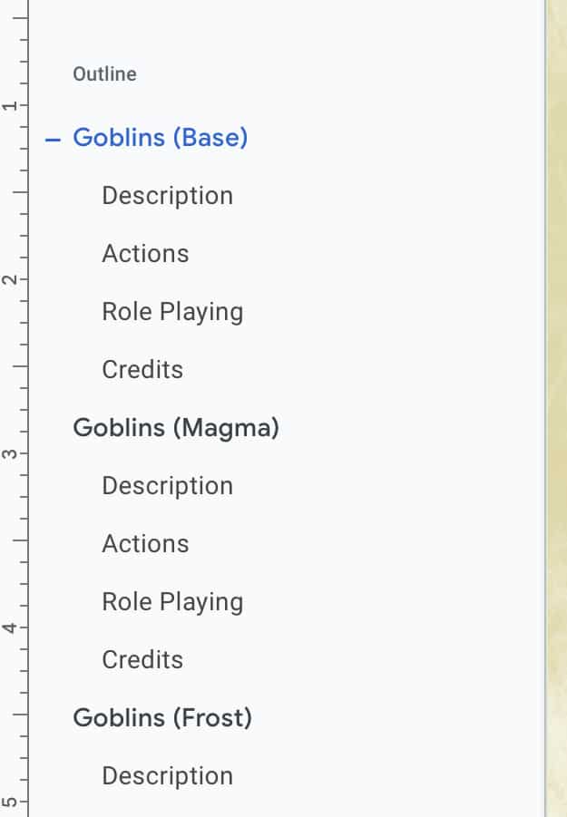
I’m doing it in this blog post as an example (and the image to the left is from one of my documents). The Title of the blog post is H1. The section “Headers – They Do So Much” is H2. And (I’m sure you guessed this) “Move In / Use a Higher…” is H3.
Keep going until you’re done with a section and you’re ready to move back up to the previous layer of Header. Wash, rinse, and repeat.
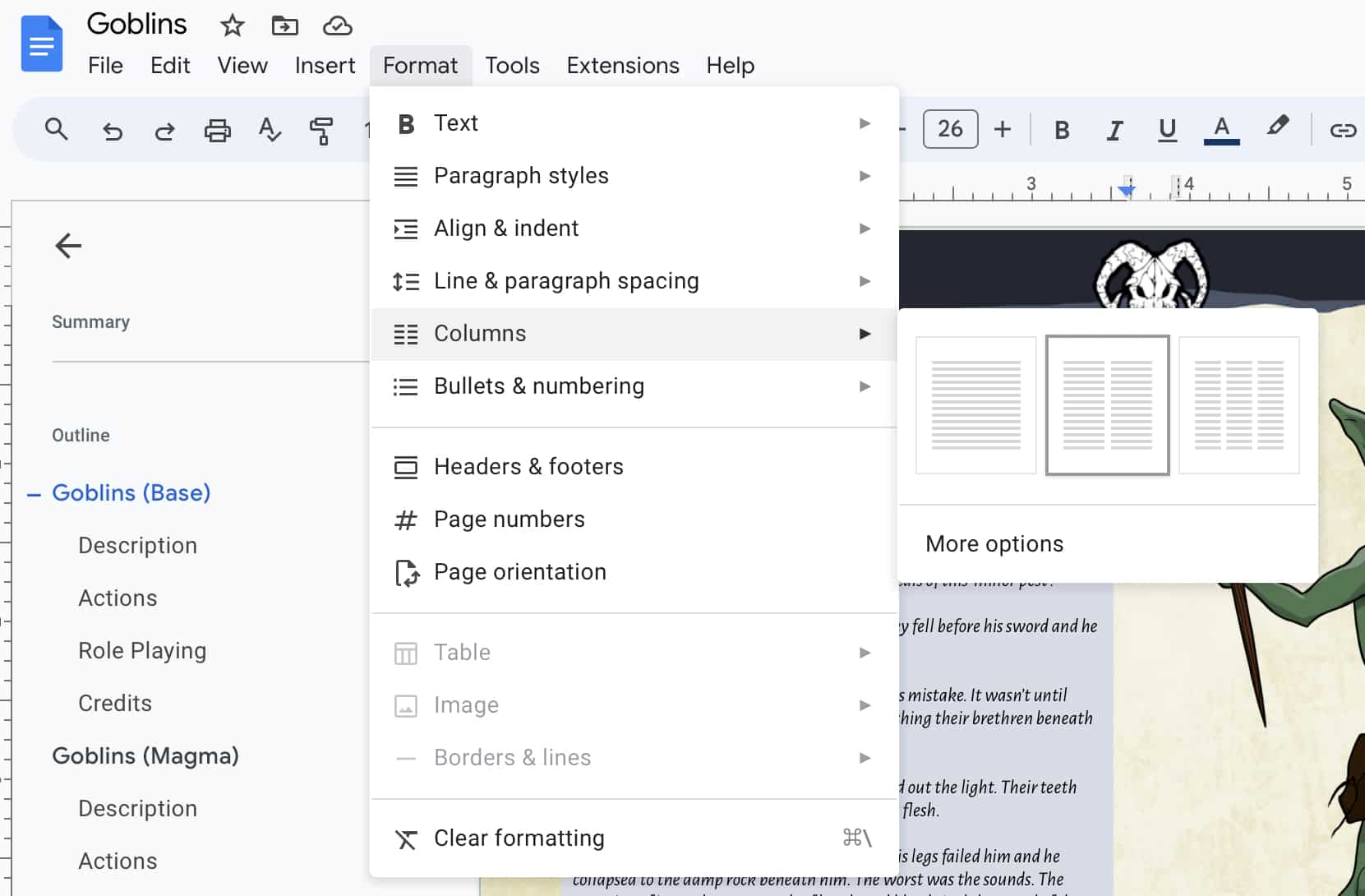
Columns – for that Classic Look
Breaking your text into columns adds some relief for the eyes in the ’empty space’ of the gutters between the text. I’m assuming that’s why traditional ttrpg books have made them the default for layouts.
No Mobile for You!
Just kidding – for a long time, working on these documents in Google Docs and on a phone or (as I do) on an iPad was… problematic. Fortunately, there’s good news on that front: Safari on the iPad now functions like a more fully featured browser would on a laptop or desktop. That, in turn, allows for far more precise work on these documents when on mobile.
Trust me when I say it’s a huge relief. If you’re working on your iPad like me, delete the Google Drive and Google Docs apps from your iPad and just do it all in Safari. You can thank me later.
Tables – the Stuff of RPGs!
Let’s face it – tables are a huge part of ttrpgs going all the way back to the beginning. Conceptually, they simplify prep for the DM / GM and build inspiration all in just a fistful of lines.
Format
The standard these days seems to be simple enough – a collection of columns and rows with alternating darkness for the background of the rows.
Table Title (D20 Table)
In the template I’ve modified YaAlex’s original, I’m using Header 5. That means that the Title will show up and be linkable in a table of contents when I’m ready for that.
I wouldn’t go any lower than that (meaning – I wouldn’t make any other parts of the table a ‘header’ because we don’t want our TOC to be 894390 items long.
Labels (d20 / Entry)
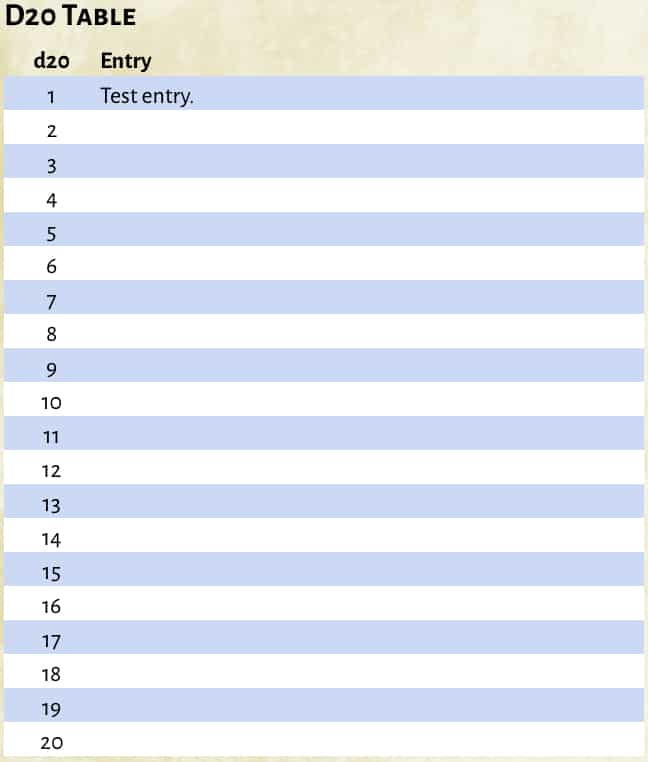
Simply create a table with at least one more row than what you strictly need for the content. That first row will be your labels for the columns.
For the text, I like to make them ‘normal text’ (ie – not a header) but I make them bold and I set the font size to a bit smaller than normal.
For the cell backgrounds, I make a point of NOT giving it a color so that the page background / art shows through.
Individual Rows
And finally – the results for your table. In the first column, your die roll numbers, and in your second, the results.
Sometimes Iike to alternate color / white for each row. Sometimes I’ll group them into something like 3 color / 3 white. I generally don’t go more than 3 rows of the same color though as it starts to get hard to track across with your eye.
Prep Work Saves Time
I think that YaAlex has the right idea. Build yourself out a bunch of different options for these tables and keep them in a document so you can copy and paste them into future projects. It will save you a lot of headaches.
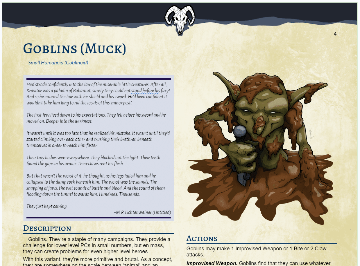
Filler Images
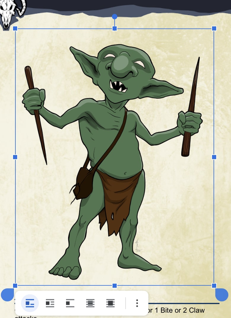
So you have some great art to inspire your readers and bring your content to life visually? Excellent. Let’s get it into your document and looking its best!
Format. I recommend using the PNG format with transparent backgrounds. I usually create them at roughly 2x the size you actually need. You can compress images down, but trying to scale them up will cause them to become pixelated. And worse? You may not see it on a screen, so you won’t know until you go to print it out!
Placement. If you’ve split your content into columns on the page as described above, just position your cursor where you want the art, then Insert > Image > Upload from Computer. It’s going to make things look janky – don’t panic. With the image still selected, you can adjust its size by click / dragging the squares in the corners. Note: NOT the blue ‘water droplets’ in the corners. That’s for modifying your selection.
Flowing Text. The icons in the lower left corner of the screen shot are for ‘flow’ of text in relation to the image. I tend to use the second option so the text flows around the image. If you scale your image to the width of the column it’s in, and kept enough clear space around it in your graphics app (in the PNG) it should read really well.
The Background – Making it Pop
The background is where we really give these documents a classically ‘professional’ appearance, and it’s surprisingly easy to do.
The Image
The entire background needs to be a single image. This is a bit of a downside to working this way, but it’s doable in most any graphics manipulation app. I use Procreate on my iPad.
Proportions of the image are important. If you’re working at 8.5”x11” in your document, that’s your image size. But – keep in mind whether you’re planning to print physical copies of your document or keep it purely digital as a PDF. Digital only, and you’ll be fine with ~100 px/inch. Printing physical copies? You’ll want to set the resolution to 300 px/inch.
Keep in Mind that you don’t want your background to make the text hard to read or be distracting from the content. To this end I tend to keep the image light in color with the exception of some decorative elements at the top.
I like to use cloud brushes and various filters and layering in Procreate to play around with things until I have what I’m looking for.
Samples for your use. Feel free to take these sample backgrounds and use them for whatever you like, as long as you credit me and link to this website. If you’re interested in a tutorial on how I make the background images for ttrpg layout in Google Docs, let me know in the comments below.
Placing the Image
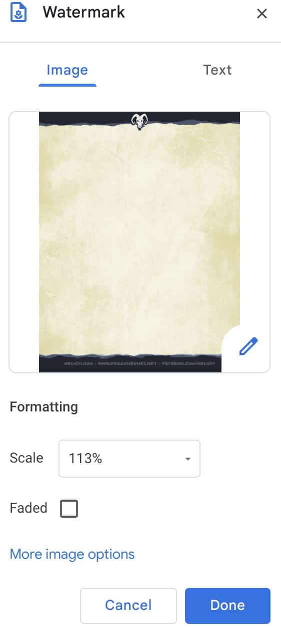
Placing the image is simple enough – just select the Insert menu and choose the Watermark option.
As you can see from the image to the left, I like to make the scale slightly larger than 100%. That pushes the image outside the page borders so that there’s no white border at the edge.
You can make the image semi transparent. This can get a little tricky, but it’s possible to make the page color something different, and the image slightly transparent if you want to ‘tint’ the image. Honestly though, I would personally just tint your image in your graphics app before you place it if that’s what you’re looking for.
Wrap Up
And that does it for the basics. We can go deeper, and if there’s an interest, I happily will! But for now, I just wanted to put down the basic elements of formatting ttrpg content in Google Docs.
If you follow the steps above to format your document, you can then just use File > Download > PDF and you’ve got your TTRPG ebook ready to go!


