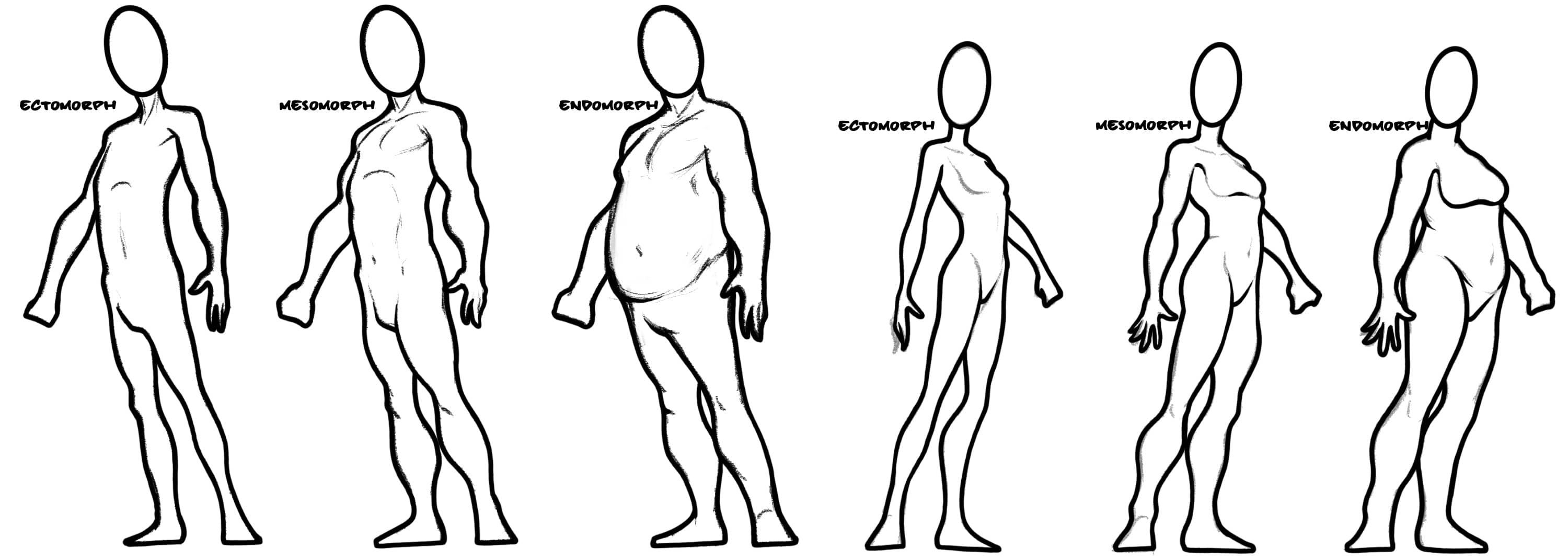
Okay, maybe it’s a little ridiculous to have a second part to this post, but I realized I borked the template in Part 1, and I started playing with color, so this started to feel like its own post.
First things first – above you’ll find the improved ‘template’ of head shapes from this set. I reduced the opacity on the lines so that you can print it out and draw over them without those lines taking center stage.
Next up, I started playing with some color. No real rhyme or reason to which colors on what, but I found it fun seeing how much character seemed to come from selecting some simple colors – even without any real rendering.
I’m a little surprised (and pleased) by how much I liked using such vibrant colors. Sure, it makes things look a little more ‘cartoony’, but it’s clear from the shapes and the extreme nature of the features that I wasn’t really going for realism here so why not lean into it?


1 thought on “Head Shapes III – Part 2”
Comments are closed.